National Trust, Lanhydrock
Developing a visual language for the C:UP renovation project and visitor experience.
The visual language will carry on to the wider interpretive installations across the route (which forms about a third of our country house offer). We want the visual language to form the cohesion between the marketing and the interpretation.
RICHARD LEVY
(Visitor Operations and Experience Manager)
The 17th century plasterwork Long Gallery ceiling is arguably Lanhydrock’s star architectural feature, featuring heavily decorated plasterwork illustrating scenes from the book of Genesis. It survived a catastrophic fire in 1881 which destroyed most of the rest of the house. An extensive restoration project was planned for the ceiling that would allow visitors to see up-close the ongoing conservation work. For the public visitor the project was going to have its own unique brand C:UP, collections, conservation, care.
An overriding aspect of the project from the Maltings perspective was that everything needed to be conceived, approved, designed, artworked and delivered in less than two weeks – for a fixed budget! The work was going to be very disruptive to the rooms and collections but equally would represent a once in a generation opportunity to see the ceiling at very close range. For the marketing material and visual language it was decided to celebrate the disruption rather than apologise for it, be playful with the branding and visual language and build anticipation in advance of the project’s practical implementation stage.
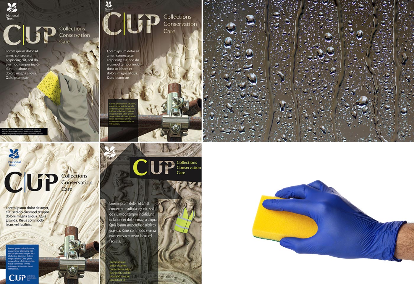
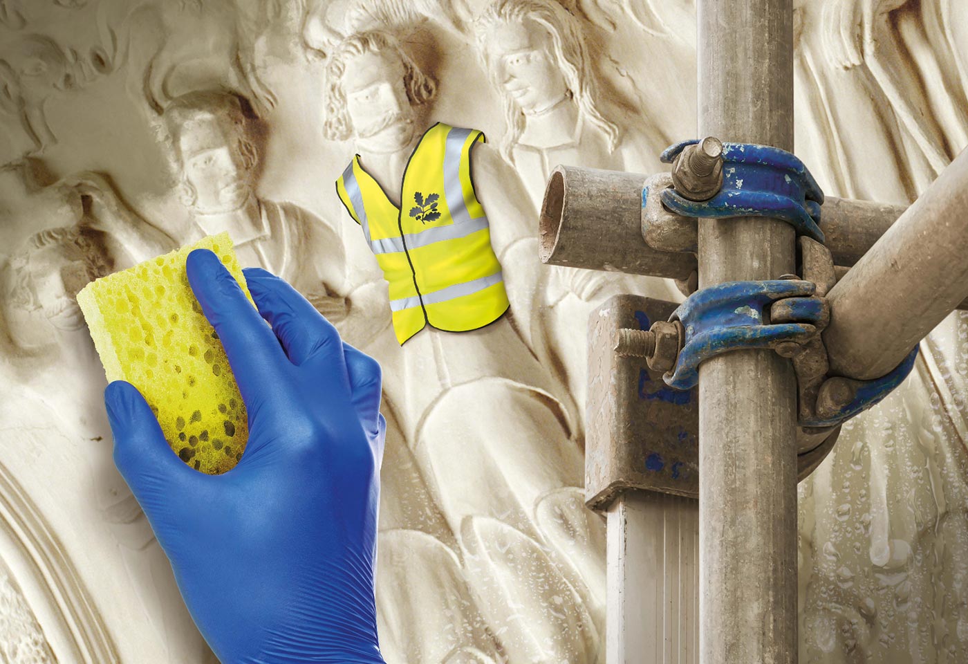
A series of images of the ceiling were available and many humorous scenarios considered with mock-ups were produced. This was distilled down to an approach showing characters featured in the ceiling in hi-viz jackets, surrounded by scaffolding. Conservation work would be shown ‘wiping away’ years of grime while the characters looked on. The Maltings in-house skills as illustrators and digital image creators came to the fore with this work – allowing the clients imagination to run free in the knowledge that anything proposed could be delivered quickly and to an exceptional standard.
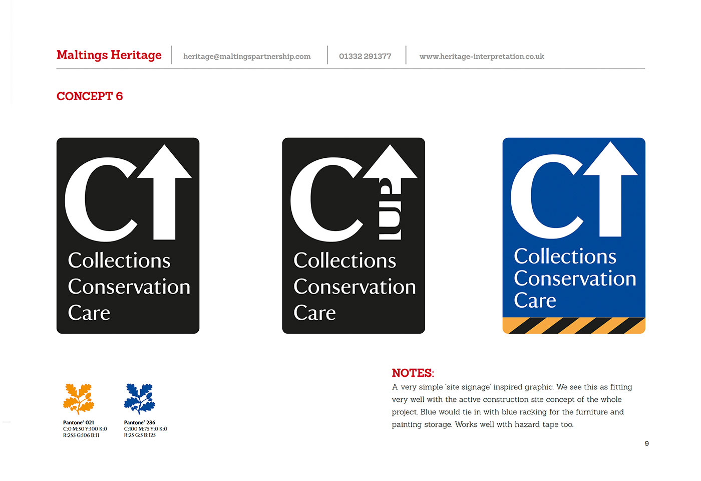
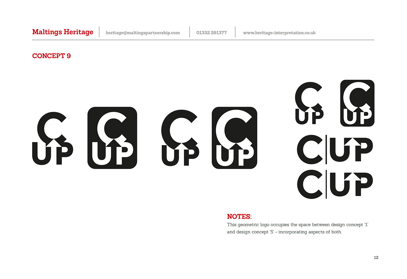
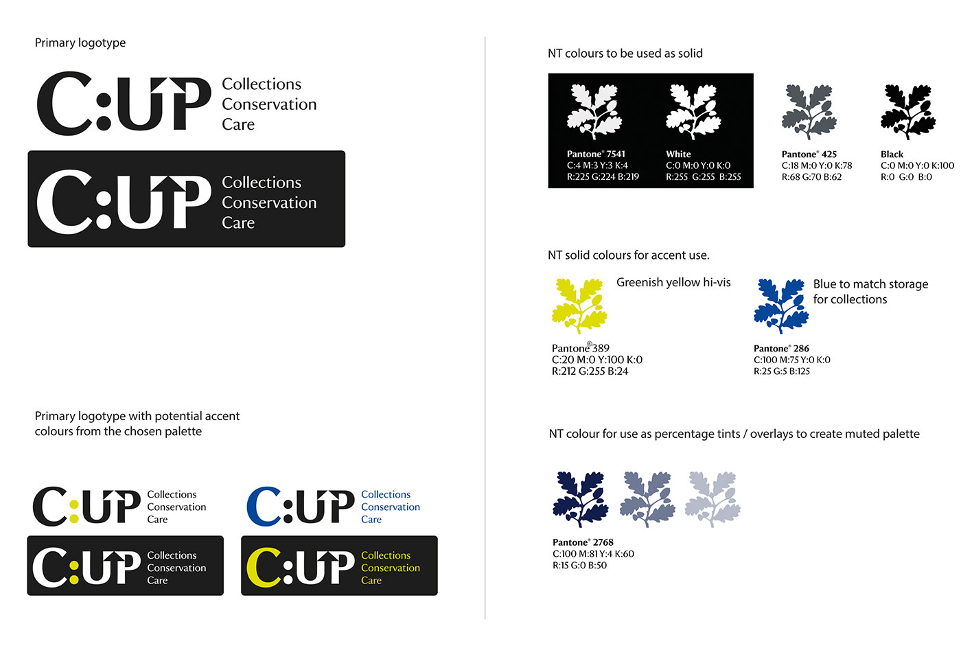
A primary logotype was developed for the C:UP brand alongside colour pallets and fonts. The colours were selected to reflect the hi-viz jackets and the likely extensive blue colours that would be prevalent on the scaffolding, protective materials applied to the floors and contractors site signage.
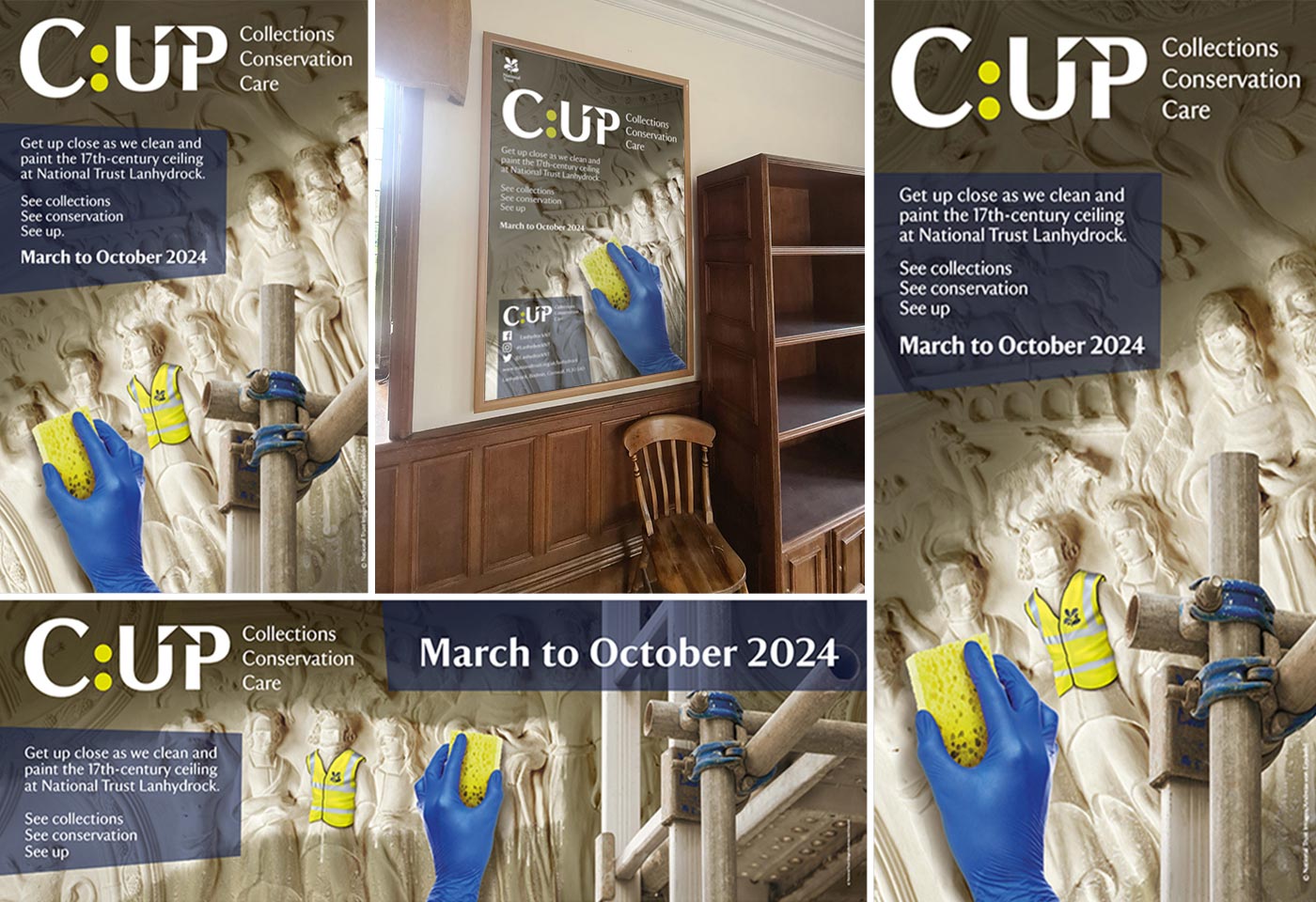
A range of final materials were produced for the marketing stage of the project including banners, posters and car park signage, some hung within actual scaffolding to really emphasise the nature of the visitor experience to follow. A simple set of brand guidelines were also delivered to guide the later stages of the project, where interpretive interventions would be needed along the visitor route through the conservation works.

